Sojourn
Travel web app
Overview
Last summer, I had to plan for a month-long trip to Europe. Planning a trip is always exciting, but I grew tired after switching between programs and browser tabs. It was especially frustrating for me to visualize the trip with details from my itinerary and the map of the region on different platforms.
Then two questions popped up in my mind: Have other travelers had the same problem? Is there a central platform where I can plan my trip while looking at a map?
Year: 2020
Duration: 2 months
Skills involved: Figma, Adobe Illustrator, Lucidchart User research, Wireframing, Prototype Design, Interface Design
Process
Discover
My inspiration for designing Sojourn comes from a personal experience. The lack of a centralized platform for itinerary planning resulted in incessant switching between windows.
This inefficient work flow was not only time-consuming, but also was frustrating and caused a loss of interest in the trip.
Research
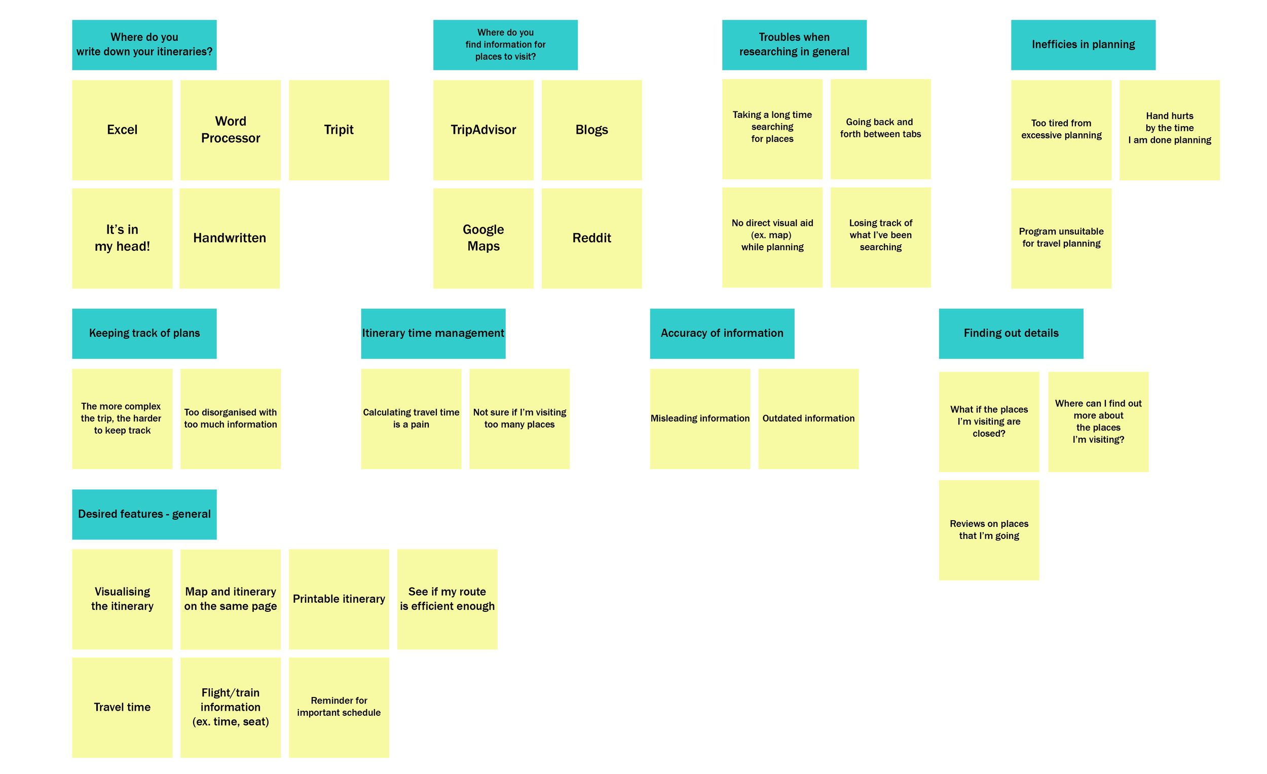
Interview & Affinity Mapping
I conducted one-on-one interviews with personal friends between early twenties and late fifties who travel regularly to get a better idea of user behavior in itinerary planning, I have also reached out to members of online travel forums and conducted interviews with five different users:
Takeaways:
Inefficiency
Participants were frustrated by going back and forth between browser tabs and programs
Participants got easily tired from inefficient flow in itinerary planning
Visual Aid
Participants wanted to view the routes as they plotted their travel points on a map
Offline Availability
Participants wanted to access their itinerary even when offline
Participants wanted their itinerary to be available in all environments.
Easy Access to Information
Participants want basic information on their travel destination
Comparative Analysis
To get a better idea of core features to itinerary planning web apps, I looked at six different websites: Tripit, Pebblar, Google Trips, Google My Map and Sygic Travel:
Persona
Jen - 22, College Student
Jen handwrites her itinerary. Due to her method of planning, she easily gets tired of planning and loses excitement from excessive planning.
Jen needs a new way of travel planning that will equate to the accessibility and simplicity of handwriting.
Greg - 31, Accountant
Greg plans his trip on an Excel file. With no centralized platform for planning, Greg finds his method inefficient due to incessant switching between windows.
Greg needs a platform that provides a visual aid and easily manipulable planning system.
Main Insights:
Sojourn needs to provide a flexible platform that will cater to trips of all purposes.
Sojourn also needs to be accessible enough so that that the itineraries can be viewed in any situation.
Sojourn must be intuitive enough so that anyone can use it with ease no matter their previous method of trip planning.
Sojourn must act as a centralized platform for trip planning, decreasing the users’ pain points and increasing efficiency.
Design & Test
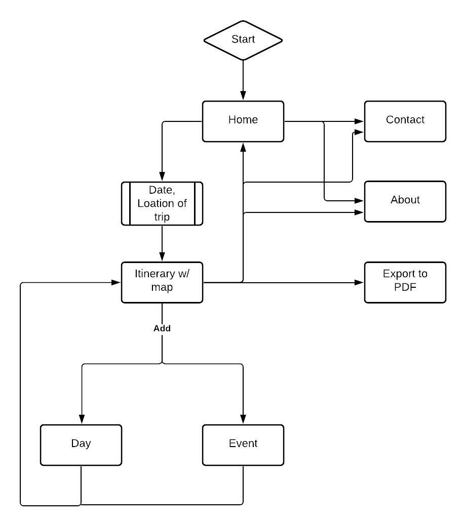
Basic Userflow:
The landing page would have a form where users would enter date and location of their trip.
The itinerary page would have the planner on one side of the page, and the map acting as a visual aid on the right side.
Clicking on the add button would prompt users if they want to add another day or an event. The new events will be added at the bottom of the itinerary by default.
As for accessibility, users will be able to export their itinerary as a PDF file, so that they can access it without using Sojourn.
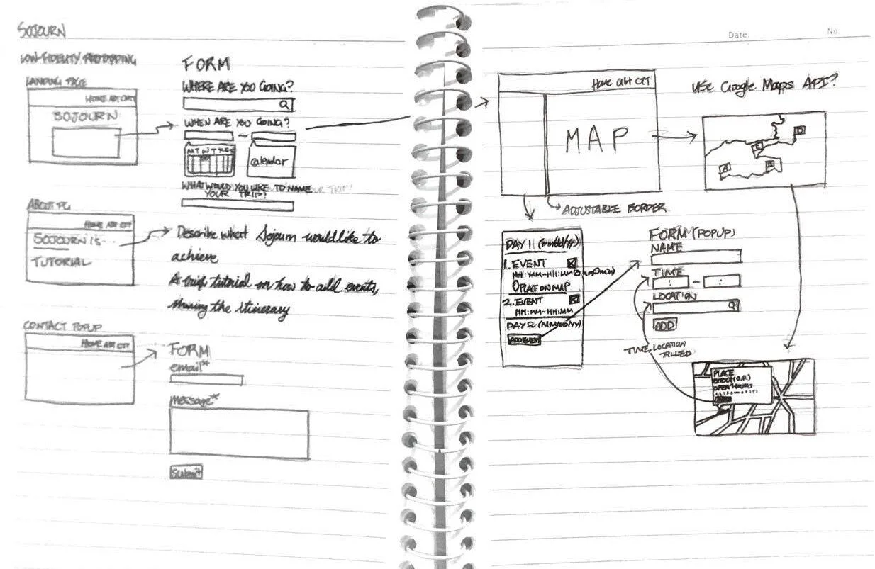
Lo-Fi Iteration 1:
User Response:
Unnecessary features
ex) "If the planner is easy enough to use, a tutorial is not necessary."
ex) "The planner should have a map and planner only, nothing else."
ex) "What is the purpose of autofilling the time?"
UI improvement
ex) Route highlight is too crowded
ex) Adding event do not need to be in a separate pop-up form
More features
ex) "How do I add days?"
Lo-Fi Iteration 2:
User Response:
Unclear features
ex) "How is a place added to the itinerary?"
ex) “Can I delete multiple events/days simultaneously?”
Unclear flow
ex) "Will clicking ABOUT from the hamburger menu end up in exiting the planner?"
Simpler content
ex) “If Sojourn is simple enough to use, is a tutorial necessary?”
ex) “I just need the most essential information”
Mid-Fi Prototype:
Main Insights:
There needs to be a way in which the itinerary can be accessed after closing the window.
Users wanted to know basic information of the places they have selected on the map.
Users were unclear about some of the features as well as the flow.
Amount of content can be reduced to avoid distracting the users.


